Impact & Outcome
The redesigned authentication system is now implemented and used across Rockwell's global organisation serving 27,000+ employees and customers.
30% reduction in account creation time, improving user satisfaction and reducing support queries
Single consolidated journey map created to align backend identity rules with front-end UX
Component updates accepted into Rockwell’s global design system, improving reuse across platforms
Progressive profiling strategy reduced onboarding friction and improved profile completion across identity types
The redesign encouraged greater self-serve behaviour, reducing dependency on customer service teams
Created high-quality handoff files that reduced design-dev friction and improved implementation speed
Key Contributions
Led UX strategy and journey mapping across complex IAM flows for multiple user types
Designed a unified user journey map consolidating multiple user types into a single system-wide artefact
Introduced progressive profiling to reduce friction at entry and improve profile completion rates
Delivered an interim iteration of the Access Hub by introducing guided journeys, copy refinements, and minimal visual adjustments enabling Rockwell to improve usability and roll out critical flows ahead of the full system redesign.
Proposed and advocated for a new navigation pattern, now adopted into Rockwell’s global design system
What this project taught me
While operating as an external partner, we functioned as an embedded design team, working within Rockwell’s internal rhythms, systems, and constraints. This meant collaborating closely across multiple Rockwell teams, including internal design, engineering, and security, to align perspectives and resolve complexity collectively rather than in isolation.
This depth of collaboration allowed us to shape decisions as they emerged, balancing usability, compliance, and technical feasibility in real time. By acting as an extension of the organisation and convening diverse teams around shared context, we were able to move beyond surface-level alignment and arrive at a cohesive, scalable solution that reflected both user needs and enterprise realities.
The Challenge
Rockwell Automation, a global leader in industrial automation, faced critical usability challenges with its legacy identity and access management system.
The system was complex, with confusing registration flows, inconsistent MFA, and shaped by backend logic rather than user mental models.
This meant users dropped off during onboarding, either due to optional sections creating decision fatigue or a lack of visible incentive to continue, leaving the system with incomplete profiles and fragmented user data.
We needed to reduce friction, simplify progressive onboarding, and support multiple user pathways, including no-contract, contract-linked, and admin roles. The redesign also introduced scalable security systems like MFA and aligned complex backend logic with a clearer, more human-first interface.


Research & Systems Audit
We started with a system audit and stakeholder interviews to identify key friction points. The system needed to support three distinct groups- admins, internal employees, and external partners, each with unique access needs. We mapped comprehensive flows for registration, login, MFA, password recovery, and access requests across all identities, then consolidated them into a unified journey map that brought clarity and cohesion to the entire experience.
Experience Principles
To align a complex backend system with a clear, intuitive user experience, we defined a set of experience principles. These served as anchors during design critiques and helped us evaluate decisions consistently across use cases, roles, and access flows.
1 Start simple, grow contextually.
Lower the barrier to entry with minimal upfront inputs, then enrich progressively based on user actions and access needs.
2 Make logic visible.
Reduce confusion by clarifying how user roles, contracts, and permissions connect, so people understand what they can access and why.
3 Design once, use widely.
Create flexible, reusable patterns that work across different access stages, roles, and platforms.
4 Lead with clarity.
Prioritise intuitive flows over technical structure, surfacing backend complexity only when it adds value to the experience.
Laying flexible foundations
Two design decisions helped shift the experience at a systems level.
✦ First, we introduced a reusable widget for login and account creation that was flexible enough to serve all Rockwell platforms, across web and mobile, while supporting varied user types.
✦ Second, we reframed profile enrichment not as an obligation, but as a path to unlocking relevant tools and personalised access. This small shift in positioning changed how users approached registration, leading to more complete profiles and better data over time.
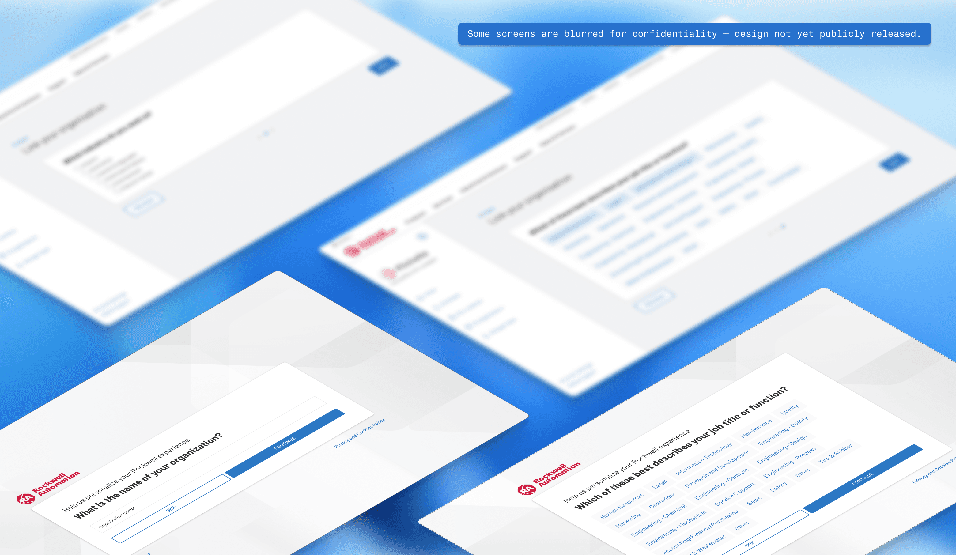
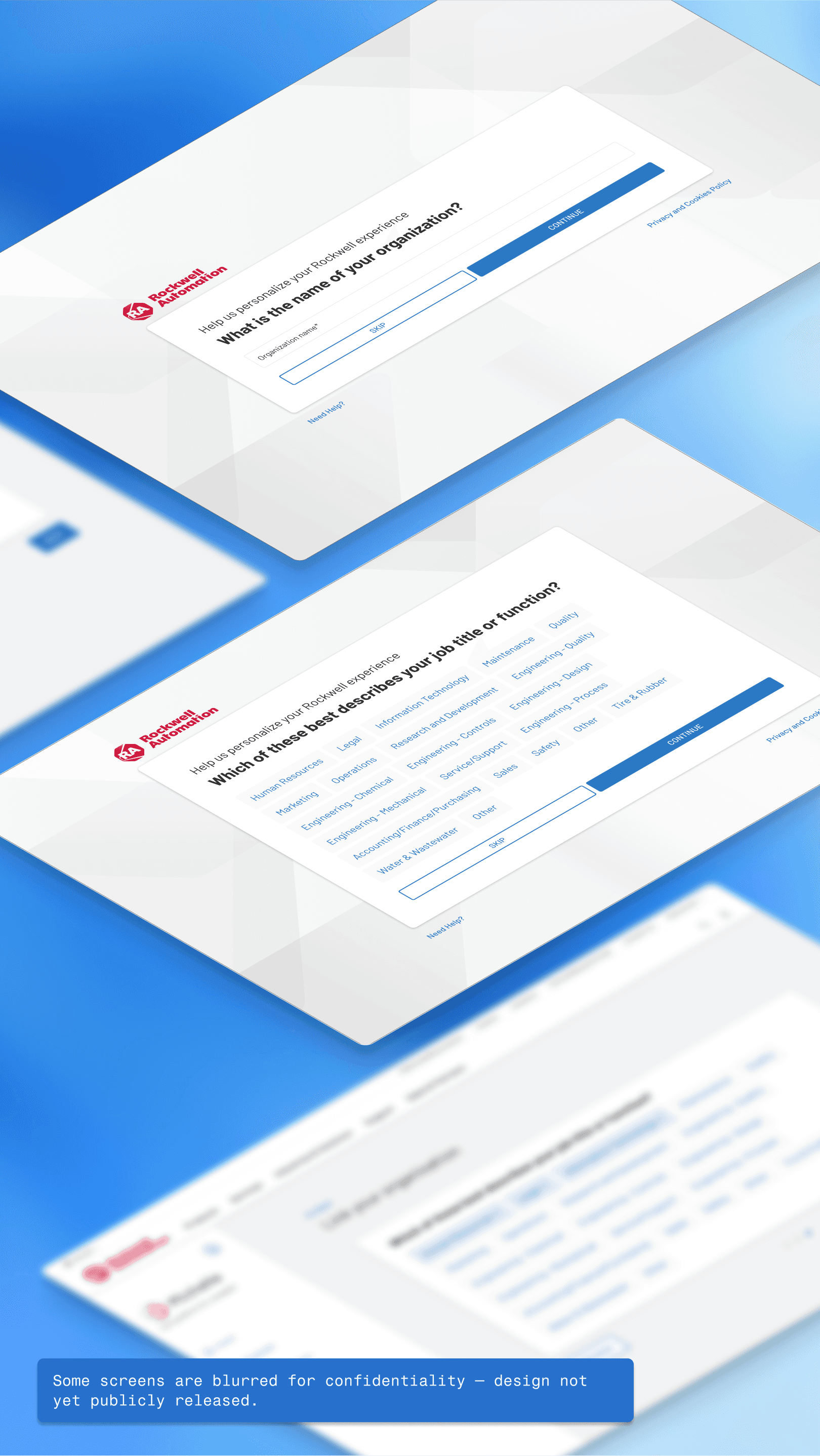
While I can’t share publicly the redesigned Access Hub, it remains one of the most layered and rewarding transformations I've worked on.


By framing profile enrichment as a path to unlocking relevant tools and personalised access, we shifted the user’s perception from obligation to value.